DATA VISUALIZATION

plastic_pollution_infographic_ copy.jpg

In my final year of college, I took a data visualization class. Despite the stress of graduating, I ended up really liking data visualization and wished I had taken the class earlier.
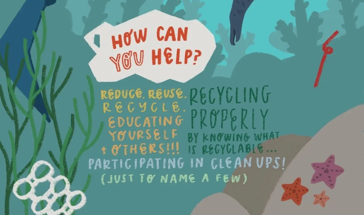
To the left, you’ll find an infographic on plastic pollution. During the last half of the term, our data visualization class focused on plastic pollution and its effects on the world. To this day, this infographic was one of my favorite projects from the class as it not only allowed me the most creative freedom, but also because I learned a lot in regards to plastic pollution and how much it has impacted our world (and continues to do so).

This is a smaller infographic on things to do in San Diego. This is something I did for fun to introduce my hometown to friends and family alike!

This is a smaller infographic on the digestive system. I wanted to make important and educational information quirky and fun for children to look at - I know how terrifying those realistic charts can be, especially as a child! By presenting the information this style, I hoped to make it less daunting and more accessible for all ages. If you want to see the other systems that I’ve illustrated, just click the image above!